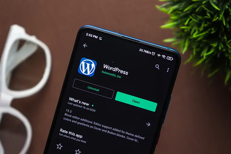
Creating a website is the need of every business these days. However, some businesses often forget that a website has to be both desktop and mobile-friendly. Because these days most people prefer viewing social media sites or going online shopping using their smartphones. The availability of services like AT&T Service makes it all the easier to do so. So, if you are considering creating a website for your business, you are more likely to use WordPress.
This blog will guide you on how to create a mobile-friendly website with WordPress.
Every website has a menu. Yours will too. And in order for you to make it mobile-friendly, make sure that the menu is responsive. A responsive menu means that it fits perfectly fine on the mobile screens when the users view it. Because the visitors will make use of the menu to navigate from one page to the other.
If the website then fails to provide the visitors with a smooth experience where they can easily move from one page to the other, no one will want to visit it again. You will also have to focus on the usefulness of your menu. If you are considering shrinking a menu, it will have its own downsides and you will have to consider alternatives.
Every website is created using a theme. You opt for themes by visiting various websites that specialize in the ‘theme-making’ department and selecting the one that you like the most. However, it is not only about you like the theme. It is much more than that.
You will have to go with a theme that is WordPress friendly when viewed on mobile. You will need to work a bit hard to optimize the theme accordingly. But hey, if it is already optimized, your job’s done. You will have to test the theme, though. Before you purchase one.
Keep in mind the touch devices when you choose a theme. Because they are all the rage these days. Whether it be laptops or smartphones, touch screens do not fail to impress. When I say that you should keep the touch devices in mind, I am talking about the elements of your website being easy enough to use from the touch perspective as well.
If your website does not offer this, the chances of visitors interacting with the major elements will decrease. This includes a call to action. If someone will have to pinch and zoom the screen just to read the elements on your website, chances of them returning are low.
If you own a smartphone (chances that you don’t are rare) you are very well aware of push notifications. In case you are not, they are the messages that pop up on your screen when a website or app needs to tell you something. Push notifications are a great way of informing the users regarding the new content or offers. Therefore, your website should have this feature as well.
Plugins are an amazing addition to any WordPress website. You should make them a part of your website too. However, you should not overlook the fact that they should be optimized according to mobile settings. Plugins enable you to add new functions and features to your website. Hence, they are very important. Do not worry about choosing the right one because most premium plugins are now mobile friendly.
A mobile screen is not as big as a desktop or laptop screen. You need to understand this dynamic and optimize the images accordingly. Because images make a large part of any website’s data. Therefore, it is crucial for you to take charge of the images. You will need to make use of tools to optimize your images accordingly.
Before you launch the website, it is important that you take the mobile-friendliness test yourself. Doing so will save you all the hassle that you would have to go through in case the website is not that mobile-friendly.
Google has its own mobile-friendliness testing tool that allows you to check all the elements. You can try your website on that too. Or you can opt for other tools. But Google remains the best of all tools to test your website.
If you take care of all the above-mentioned features, you will create an amazing website. However, make sure that you follow the model that AT&T Customer support has. If a visitor is unable to find something on your website. Or if they have a query, your customer support centre should be just as efficient and responsive as your website. That can literally be a deal maker or breaker.
You may also like: The Equal Merits of Design and Content
Image source: Shutterstock.com

Generating leads is a crucial...

Welcome to the Future of...

It is evident that social...