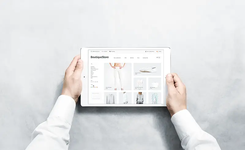
“User experience isn’t just ‘when users go to our websites.’ User experience involves how users first heard about our organisation or how they continue to interact with our organisations. There’s a bigger world outside of our work.” – said Gregg Bernstein, the author of Research Practice.
Effective user experience includes an uninterrupted and value-packed website experience for your visitors and potential customers. And it involves having a functional yet contemporary website that assures a seamless and fluid experience.
Remember, a good user experience doesn’t equate to designing an aesthetically pleasing website because aesthetics doesn’t mean much if a web page takes too long to load.
When a user turns away from your site, it doesn’t only lead to an increase in bounce rate but also influences a substantial amount of revenue.
At this point, if you want to work on ensuring an unrivalled user experience, check out a few result-oriented tips below!

It’s a practical approach to begin your website designing project after learning about the demographic or group you want to target. Having an idea about your target audience will enable you to develop a web design idea that resonates with them, and they’re likely to visit and spend time on it.
Let’s suppose most of your website visitors are from Generation Z. This group spends about $44 billion in the retail market. The numbers are impressive, aren’t they? So, your task is to design a website that aligns with their preferences. For example, Gen Z prefers a streamlined site layout that loads fast and works on hand-held devices. And while designing your site, keep general preferences in mind, such as colour scheme, layout, effects or elements, etc.
Chances are Gen Z will visit your site through their mobile devices, so place clickable elements within their thumb’s reach and incorporate responsive graphics as they make viewing easier on smaller screens.
Did you know users take only 2.6 seconds to form a first impression about your site?
Because users usually have a sense of where a site’s navigation should go. If you deviate from the norm, visitors may feel frustrated and bounce back from your web page. This is why it’s essential to have an intuitive layout as it points to where the key features are, making your site accessible.
The navigation forms the entire architecture of your website. You can analyse the internal analytics to see where visitors go when they first land on your site. More so, where you place elements in your navigation bar also makes tons of difference.
For instance, you need to keep critical categories at the front and less important ones farthest to the right side. Visitors often click on the home button to go back to the landing page, so it must be on the farthest left or top of the navigation bar.
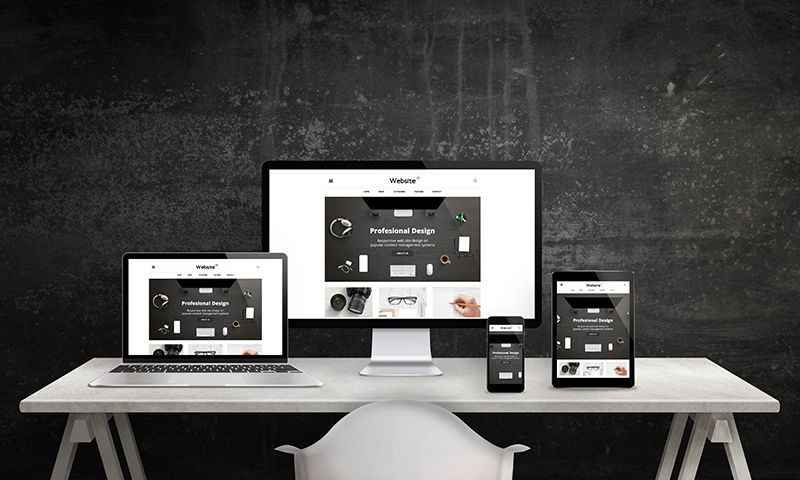
Crazy Egg suggests that white space around text and titles elevates user attention by 20%. With adequate amounts of whitespace, you can make your designs look polished and innovative.
However, whitespace doesn’t mean having a white background. It’s just space between elements of the website. With the technique, you can incorporate simplicity and elegance into your web pages.
You can also utilise whitespace in the following ways to enhance user experience:
Group or surround correlated elements using whitespace.
Use the line space for your text in the body.
Keep it in the long text blocks on the right and left margins as it improves comprehensive up to 20%.
Consider whitespace as an essential design element that enables you to maintain balance on the page and boost readability.
It facilitates the web designing process and helps position site elements as a design element. For example, with appropriate whitespace, you can keep sections separate and guide the eyes.
A few elements on your website can hinder the value and message you’re trying to convey. Specific examples can be complicated animations, extensive content or stocky website images.
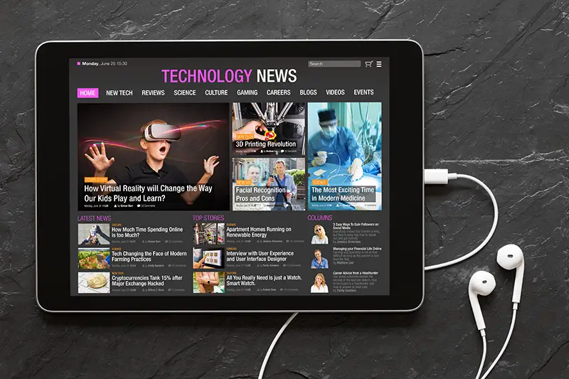
Considering the attention span of internet users, you need to figure out what you want your audience to see or learn on your page, and your design must adhere to that.
Because using arbitrary colours and varying font styles with different sizes can distract users and create visual confusion for those trying to convert. Therefore, you need consistent brand guidelines to keep your entire site clutter-free.
From font styles to iconography to logo usage, you need to be sure about every element to avoid any struggles while designing your pages.
Avoid several on-page animations or interactions as it overwhelms and distracts users from focusing on what’s essential on the page. Or, save yourself from the hassle and let website design Dubai help you create a user-friendly website.
Before you explore or research different ideas for your website design, ensure that it aligns with your brand and resonates with your target audience.
You can also use the following ideas for inspiration.
An eye-pleasing colour scheme is a great way to welcome a user and make them stay. You can think about colours that are easy on the eyes, such as pastels or neutrals.
With pastels and neutrals, you can promote a sense of calmness and relaxation. Therefore, don’t hesitate to use pastel blues, warm browns, cool greys and sand tones.
You can also think about getting a neural background as it allows a brighter or contracting foreground to stand out. It also brings the user’s attention to the branded visuals or products while taking them towards essential elements, such as CTAs.
The magic of vivid colours never goes out of trend, but it depends on how they are used in the design domain. For example, if your brand belongs to either a tech or media industry, you can think about using vivid shades or hues.
For example, a splash of blazing colour could turn out to be a game-changer. You can express your creativity by merging and intensifying different shades into gradients to achieve the desired effect.
Did you know that motion attracts attention? So the more attention you provide to the visitors, the more they respond to it.
You can try anything from subtle animation to sweeping page transitions to eliminate the static vibes from your design.
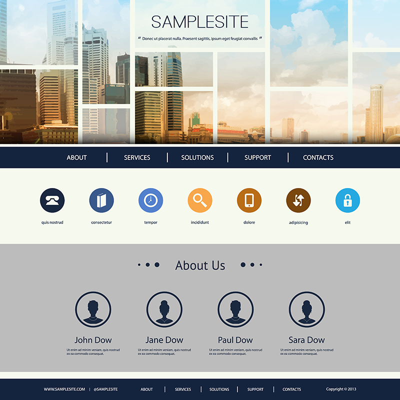
Incorporating iconography into your design is another excellent way to improve the user experience. With relevant icons available, users can select which options will work to fix their situation and find the best product.
This approach can help save users hours of searching your website and prevent them from the hassles of speaking to a sales representative.
And the quicker a user will find a product, the quicker they might place an order to purchase it. Considering this tool will also set your company apart from your competitors and assure a unique user experience.
No doubt, a user expects a seamless and fast web experience. They want to visit or shop without interruptions. However, any hurdle in the process can make them leave the site and look for a better and faster solution.
You can try implementing these tips and stay ahead of the game. And to make the most of your website, don’t forget to make it mobile-friendly and conduct A/B split testing.
You may also like: 7 Tips: How to Make a Mobile Friendly Website with WordPress
Image source: Shutterstock.com

Generating leads is a crucial...

Welcome to the Future of...

It is evident that social...